Scratch Your Own Itches
or creating things you care about
How to create a useful project?
People sometimes ask me how to get started with programming, to which I usually respond with a question of my own: "do you have any itches of your own to scratch?"Usually they don't get what I mean by that, and you probably don't either, so let me elaborate.
If you want to create something, it helps if it would be something you'd be using as well. If what you make doesn't solve a problem, or have a purpose, then there's a fair chance no one will use it.
Creating something for yourself, something that solves a problem for you —in other words a tool that scratches one of your own itches— will help you keep motivated, and even if others don't find it interesting, it won't be a waste of time as it will still have a very important user: you!
My own itches:
Over the years I've had a whole bunch of ideas, but imho the most interesting or useful ones are the ones I still use myself because they solved a daily/weekly issue for me or helped reduce repetitiveness of annoying tasks.
Reddit Enhancement Suite Dashboard
 |
| Default RES Dashboard |
The default Dashboard has a lot of wasted space. If you want to follow a bunch of subreddits, you kind of have to limit the amount of rows to be able to view multiple ones at the same time.
I reckoned I could improve this, especially seeing how much empty black space is left on the screen. I wanted to make the widgets a lot smaller, and fit two next to each other. I also thought that some of the buttons had too much text or were too wide, so I would want to tweak those too.
Since the RES Dashboard is just a rendered website, I knew I could tweak things by writing my own userstyle; a Cascading Style Sheet (CSS) that overrides the existing styling rules. The easiest ways to implement one on Chrome is by using an extension such as Stylish or StyleBot and writing your override rules in that. Of course you can also prototype using the element inspector or Firebug, but those changes aren't permanent.
So, after installing either of those extensions (I'm still undecided which one I like best; though I'm leaning towards Stylish) I started prototyping. Using Chrome's built-in element inspector I found out the classnames of the elements I wanted to change, and began by making the widgets smaller and turning them into inline block elements so they could fit next to each other. It involved quite some experimenting to find the best fit, and a bunch of resizing and checking on my other computer to see if it worked okay on a different resolution as well.
As I started using it more and more, I also started experimenting with other tweaks; some of them successful —such as the overlay version of the expando boxes— while others were nicer in theory than in practice —for instance the widgets that would expand while you hovered over them; the constant resizing was distracting— but every idea brought me more experience and sometimes new ideas.
 |
| Reddit Enhancement Suite Userstyle My tweaked version of the RES Dashboard. |
Google Plus' New Layout
 |
| G+ Default single-column layout |
When Google Plus (G+ for short) introduced their new layout, a lot of people were complaining about how horrible the new columns layout was; sure you could switch to a single column layout, but that only left you with way too much whitespace.
 |
| G+: Default multi-column layout |
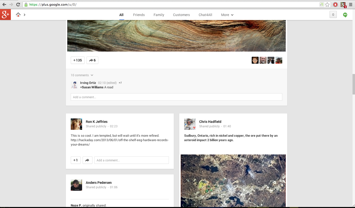
Personally I quite liked the multi-columns layout, but I didn't like the smaller width of the cards (as the boxed posts are often called) as it made YouTube videos too small, and again brought too much greyspace/whitespace with it.
I knew I could just complain about it and hope for the problem to go away by itself and in the mean time have to get used to the new smaller content. However, I realised it most likely wouldn't get fixed any time soon (if at all), and that in the mean time I would just get more and more annoyed at the layout and it would ruin my experience. So, what was I to do?
Well, I could (and would) do the same as I did for my RES Dashboard: create a userstyle that would override the widths. Within an hour I had something usable; something that increased the width of the single column layout either to the full width of the page, or to a medium width single-column layout, which was still at a legible line length. I also had CSS rules for the two-column and three-column layout.
I was mostly satisfied with the three-column tweaks myself, but decided to share all of them, and some people from the community loved me for it! Some of them improved upon it, others had already come up with their own solutions in the mean time. A couple users asked how they could further tweak certain aspects, or came with suggestions for other improvements.
 |
| My tweaked G+ Three Column Layout - one of the earliest revisions. |
After some more tweaking I also released the code I had as-is on UserStyles.org. I didn't really keep it up-to-date though, especially since by now more custom stylesheets have become available, and I didn't feel like maintaining this with other solutions already out there. Besides, in the end I was satisfied with what I had, and I wanted to be able to instantly tweak things without worrying about breaking things for other users. Another reason was that I had support for various layouts that required commenting out CSS rules; something that didn't really work with the existing userstyle extensions as they would strip out comments.
Conclusion
I realise I haven't really talked about how to actually get started with programming, but I think it's best for someone to first think about what they will be creating and why/what for. The more they think about their project first, the more they can get excited about it, and the easier it eventually will be to get started.
This is what my wife did with her balloon art! She never cared much for balloon twisting; poodles, giraffes, etc. were all variations on a simple tired theme. Then she saw a beautiful unicorn. The artist was out of time to make one for her but said, "Here's my card. I'll teach you. You'll be great at this!" My surprised wife learned how to make a unicorn for our daughter's birthday, and now has a business as a children's entertainer.
ReplyDelete